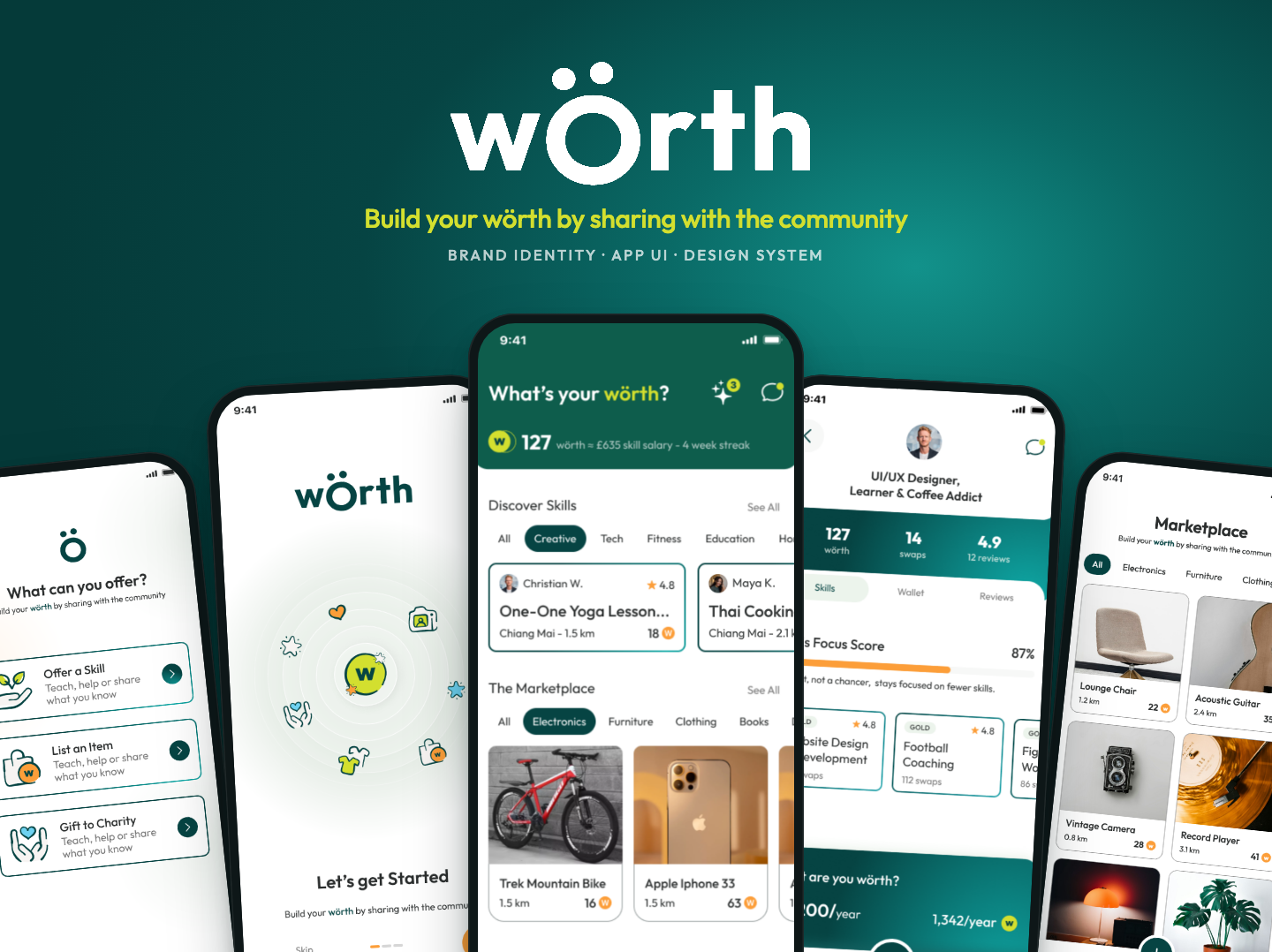
A community app where people swap skills, list items and gift to charity, and a brand that makes everyday contribution feel warm and simple.
The idea
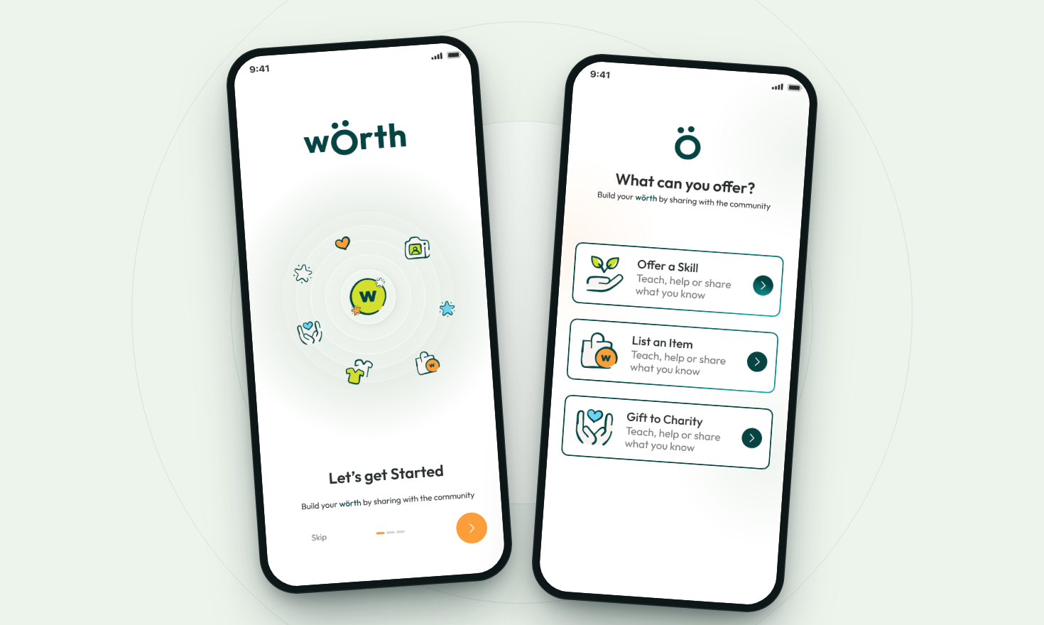
wörth is a community app built around one simple question: what’s your wörth? Instead of money, people build wörth by offering a skill, listing an item they no longer need or gifting to charity, then use it on what others nearby are sharing.
The challenge was making a new kind of exchange feel instantly familiar, and keeping it warm and human rather than transactional.
What I designed
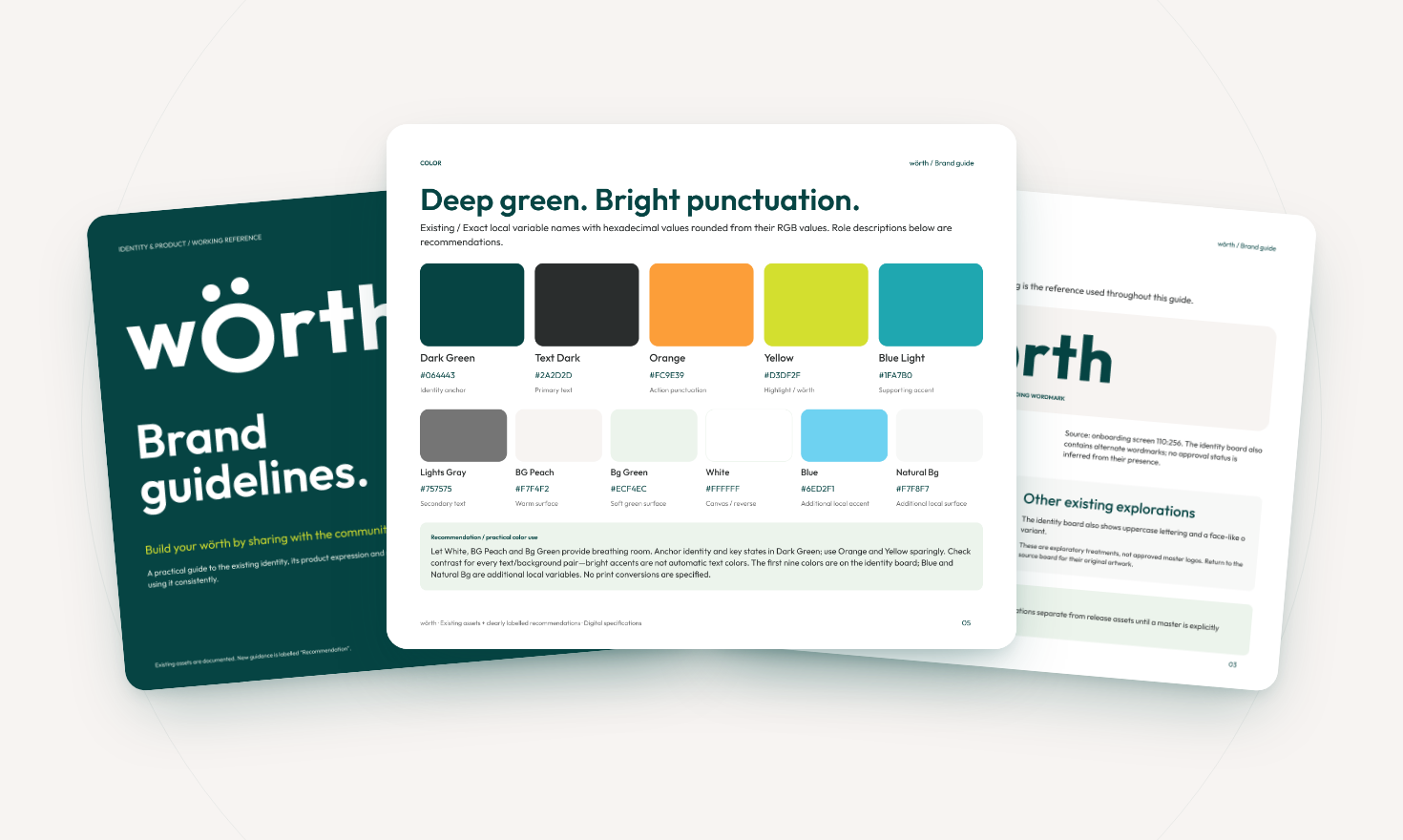
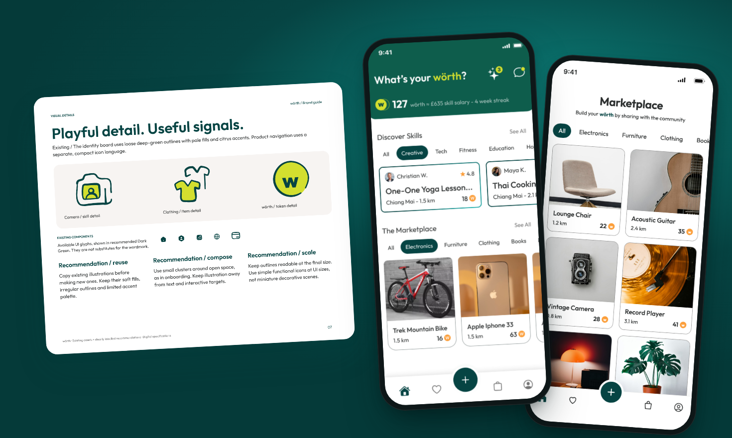
The brand grew from the wordmark itself. The ö and its two dots became the heart of the identity: part letter, part friendly face, part orbit. I paired a deep green anchor with bright citrus punctuation, rounded Outfit type and loose, hand-drawn line illustrations with soft fills.
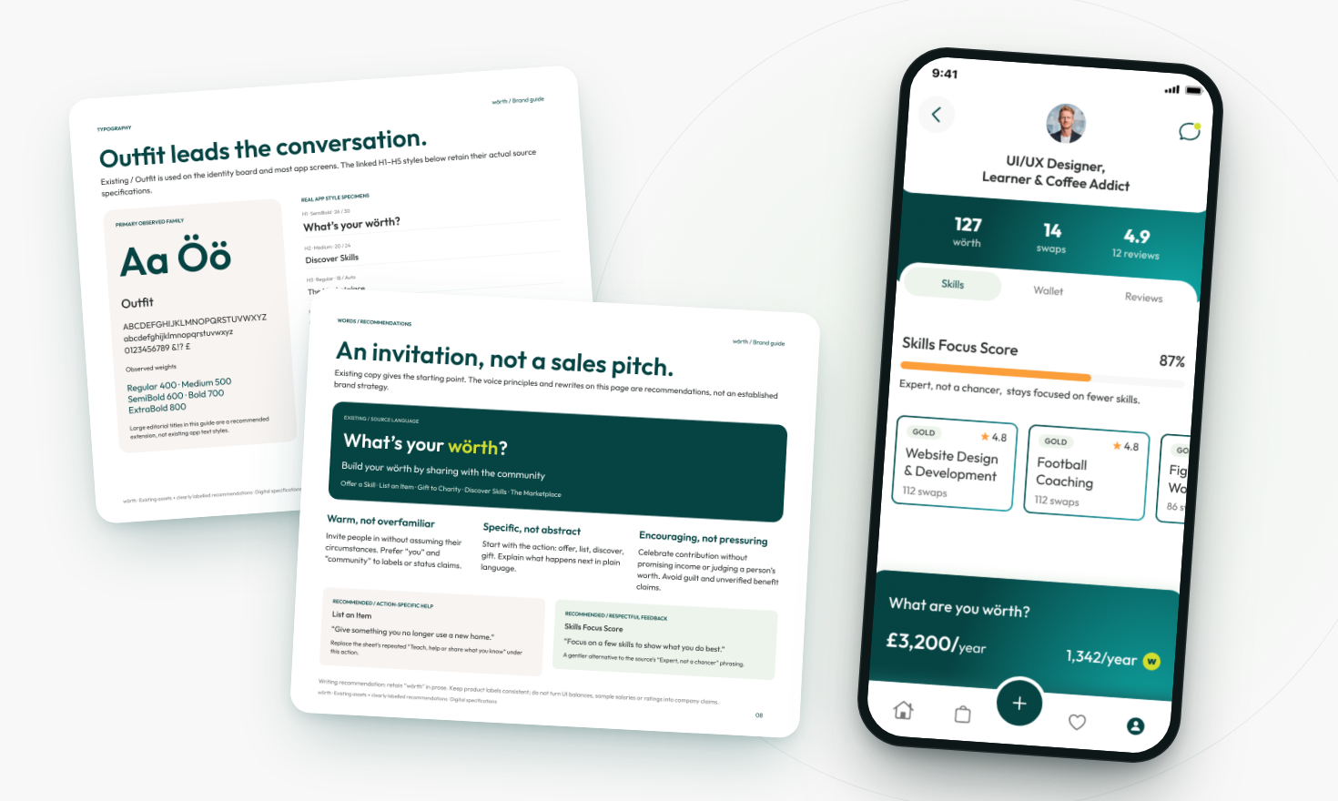
From onboarding to marketplace to profile, every screen follows the same few rules: rounded cards, one clear action at a time and accents used sparingly. Balances, ratings and swaps sit exactly where you expect them, and illustration stays away from anything you need to tap.
Alongside the screens I put together an 11-page brand guide covering logo usage, colour, typography, illustration, voice and a practical pre-flight checklist, so anyone designing for wörth can keep it consistent as the product grows.
wörth is an ongoing app design project. All people, ratings and balances shown are sample data.
Screens
Inside the project
Brand guidelines and key app flows, from first launch to a full profile.