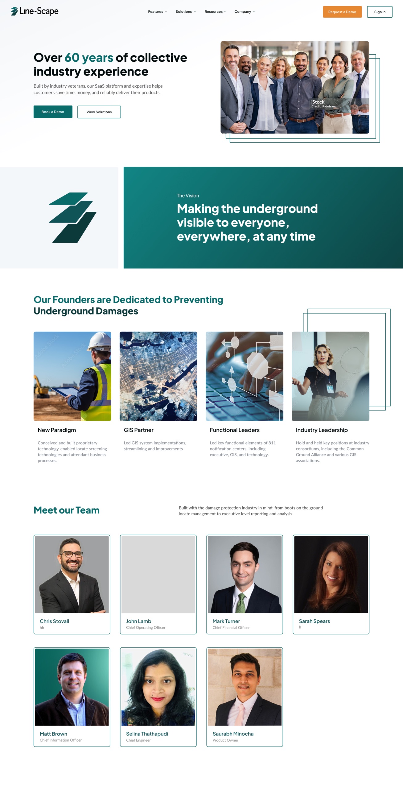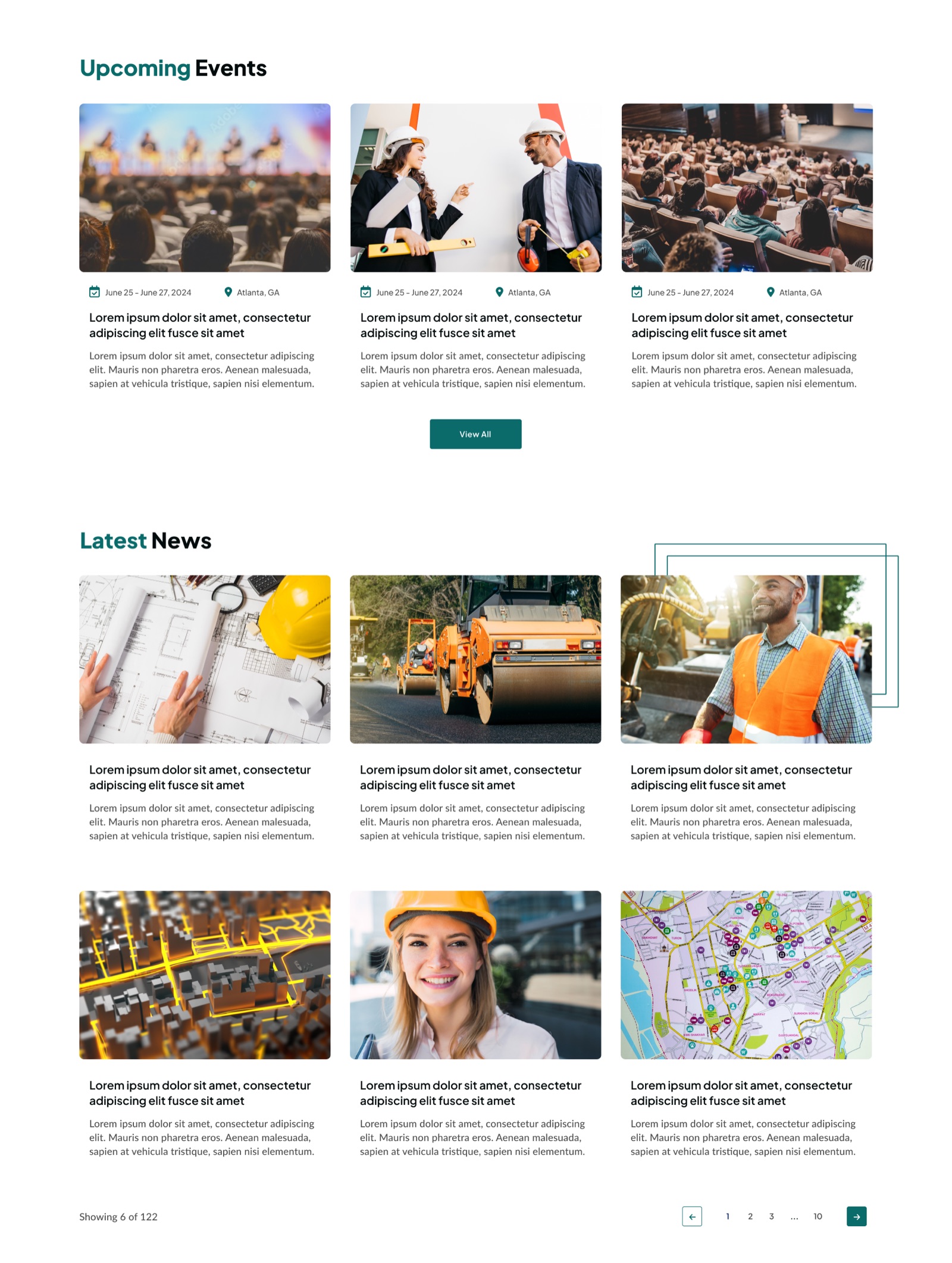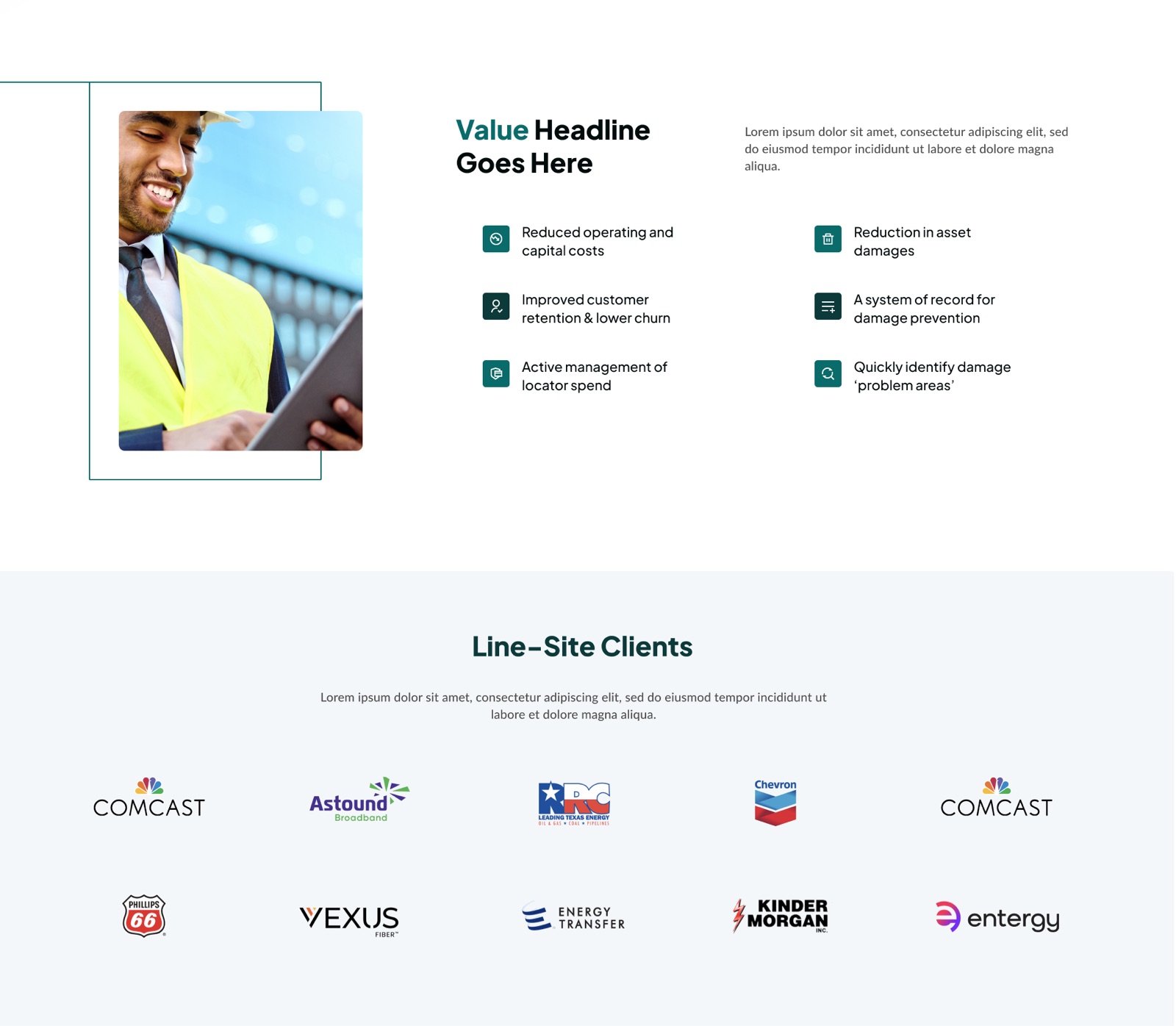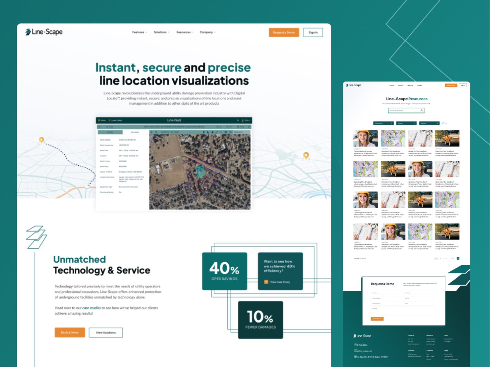
A SaaS platform protecting critical infrastructure deserved a website that looked the part.
The challenge
Line-Scape is a Dallas-based SaaS company doing genuinely important work — their platform helps utility companies manage underground damage prevention, handling everything from digital locates and ticket routing to GIS-based decision making and real-time analytics. Clients include Energy Transfer, Kinder Morgan and Astound Broadband. The kind of software that literally stops people accidentally digging through pipelines.
The brief, prepared with a US agency, was a full redesign and rebuild — custom WordPress theme, no builder, clean infrastructure — built to last and easy for a small internal team to manage long-term. The bigger challenge was brand definition: Line-Scape needed to establish a clear visual identity from scratch, define their messaging, and create a site structure that could speak to very different user types — from field locators to finance teams to C-suite executives at major utility companies. A knowledge base for existing customers was also on the list. Up to 25 pages, 12-14 weeks to deliver.
What we delivered
This one was a proper design challenge and honestly one of the more satisfying projects to work on. The UX had to work hard — Line-Scape’s product suite is feature-rich and their audience spans everything from boots-on-the-ground field teams to boardroom decision makers. Getting the information architecture right was everything.
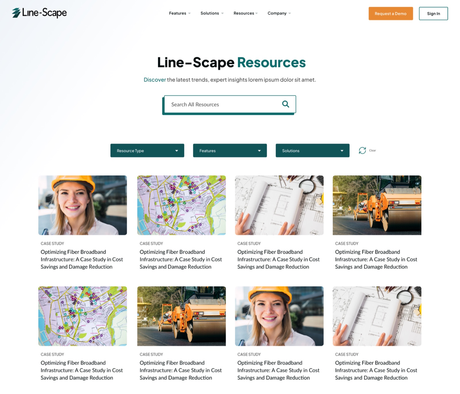
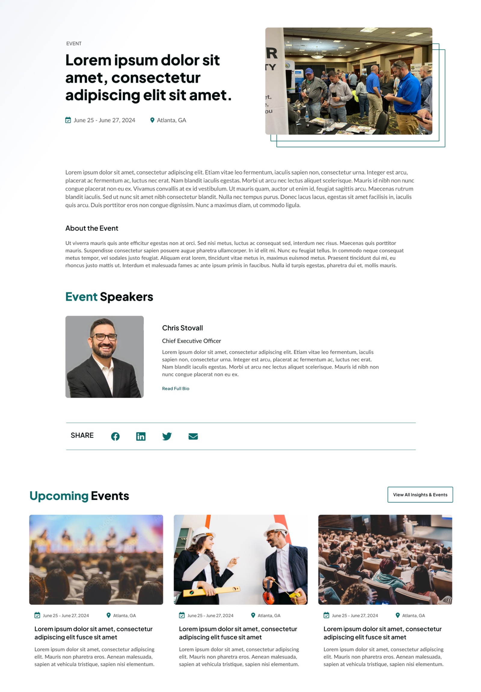
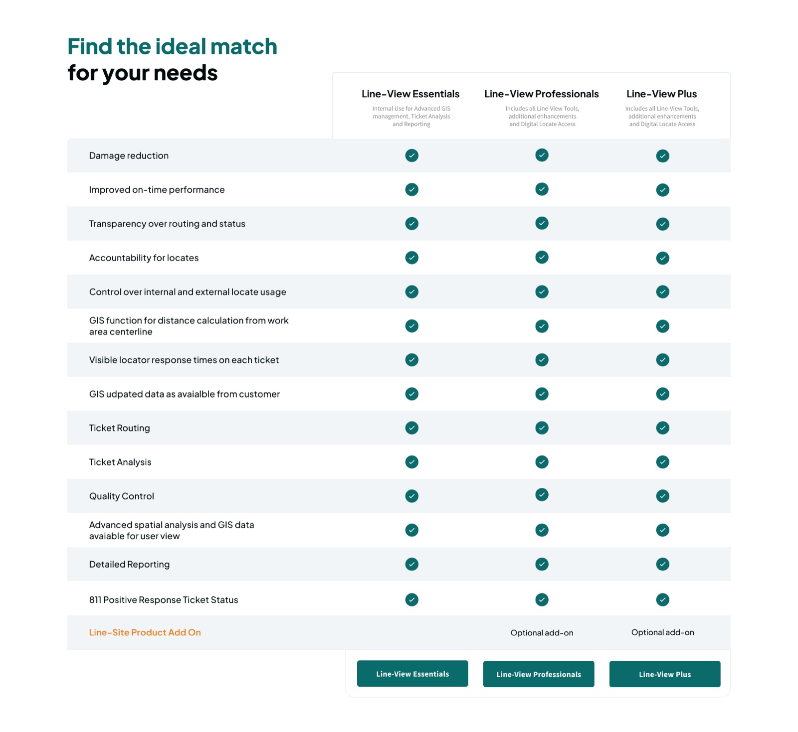
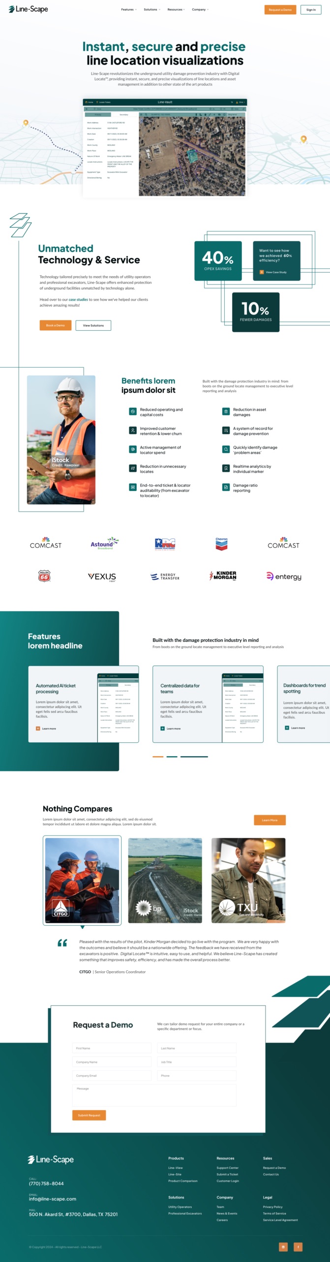
Working through Figma, I mapped out the user journeys for each audience type, building clear funnels that guide the right person to the right solution without the whole thing collapsing under its own complexity. The UI leans into a bold, tech-forward aesthetic — dark tones, strong data visualisation, clean feature layouts — the kind of visual language that immediately signals “this is serious software built by people who know the industry.”
The finished site looks credible, modern and nothing like the competition. The client’s own numbers say it best: 68% OPEX savings, 20% damage reduction, 61% safety improvement. The website doesn’t build the product — but it tells that story properly now.
Screens
Inside the project
7 screens from the finished design. Hover a tall screen to scroll the full page.